2025-08-10 Weekly Notes
Weekly notes
This is a compilation of blog posts, plots or drawings I’ve made throught the years.
Weekly notes
Weekly notes
Weekly notes
Weekly notes
Weekly notes

Weekly notes
Weekly notes
Weekly notes
Weekly notes

Weekly notes
Weekly notes
Weekly notes
Weekly notes

Weekly notes
Weekly notes
Weekly notes
Weekly notes
Weekly notes
Weekly notes
Weekly notes
Weekly notes
Thoughts and notes
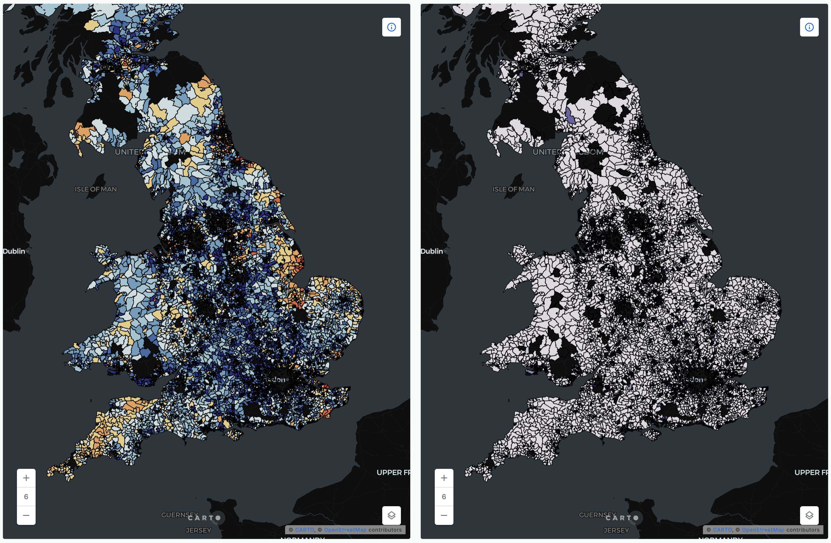
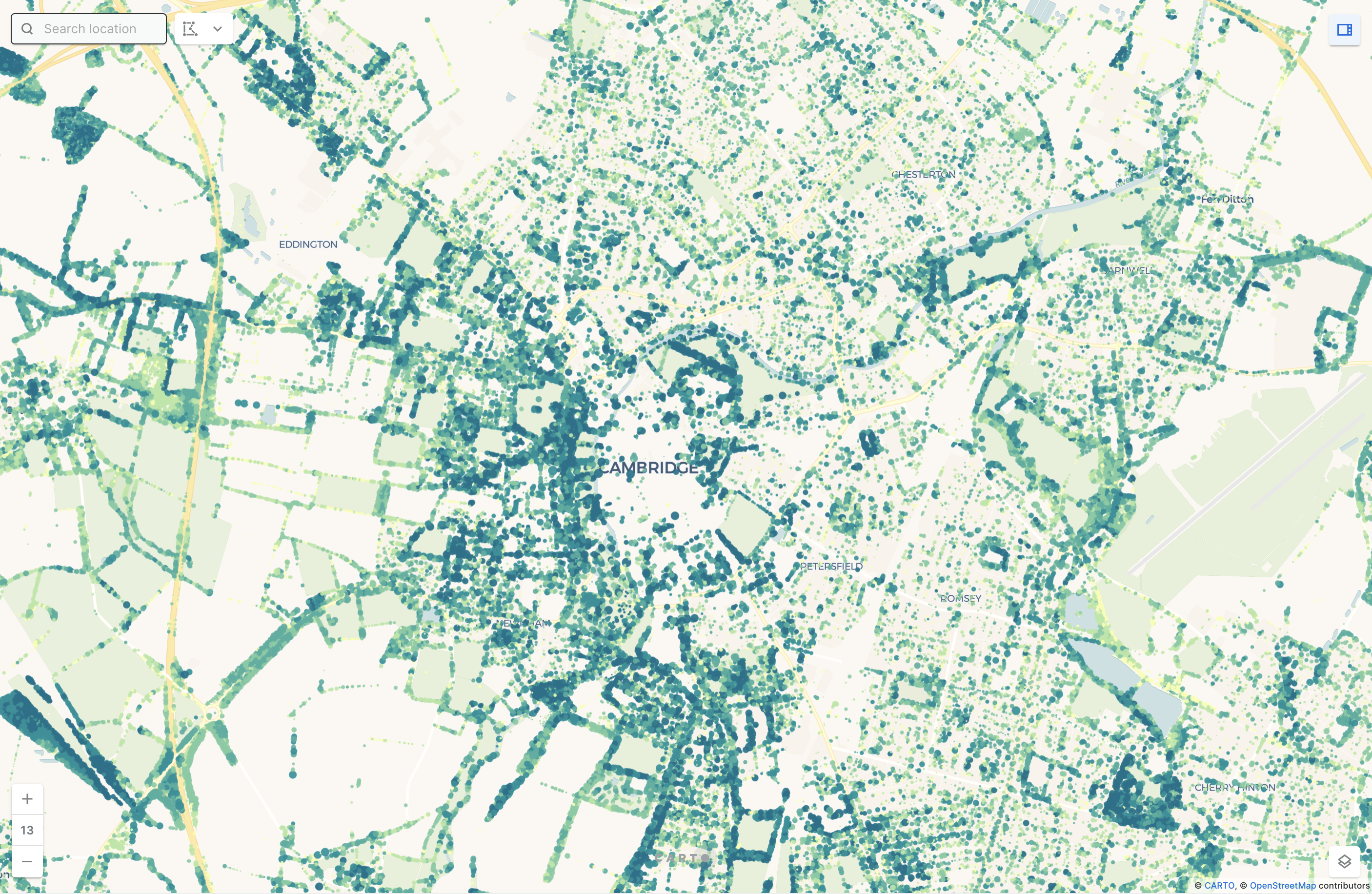
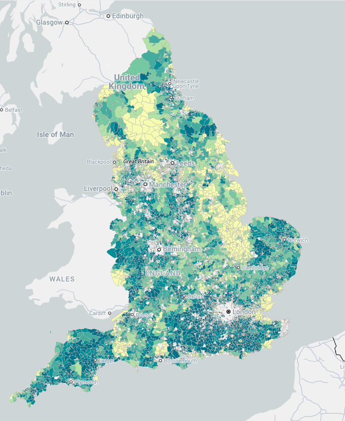
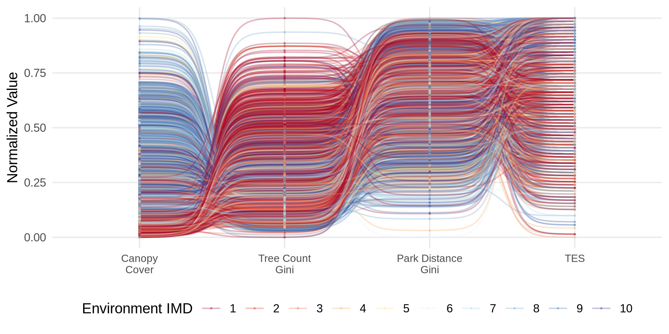
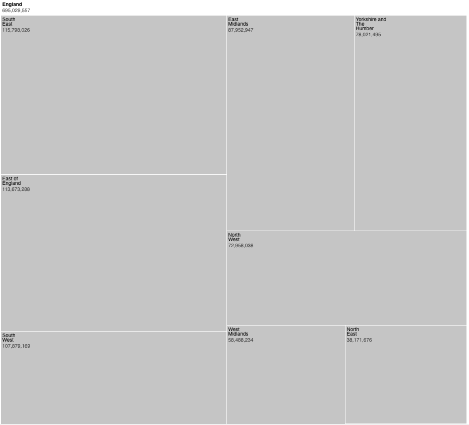
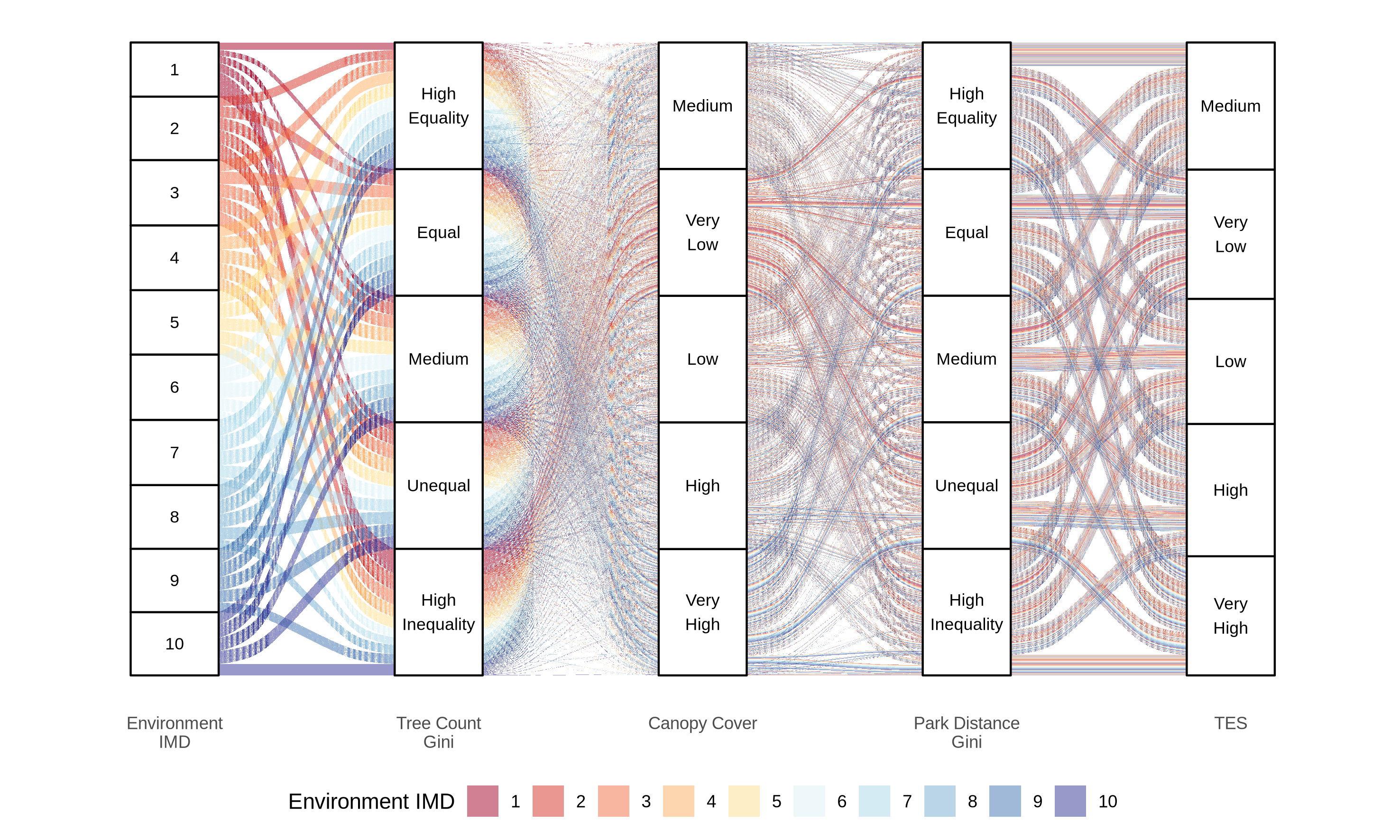
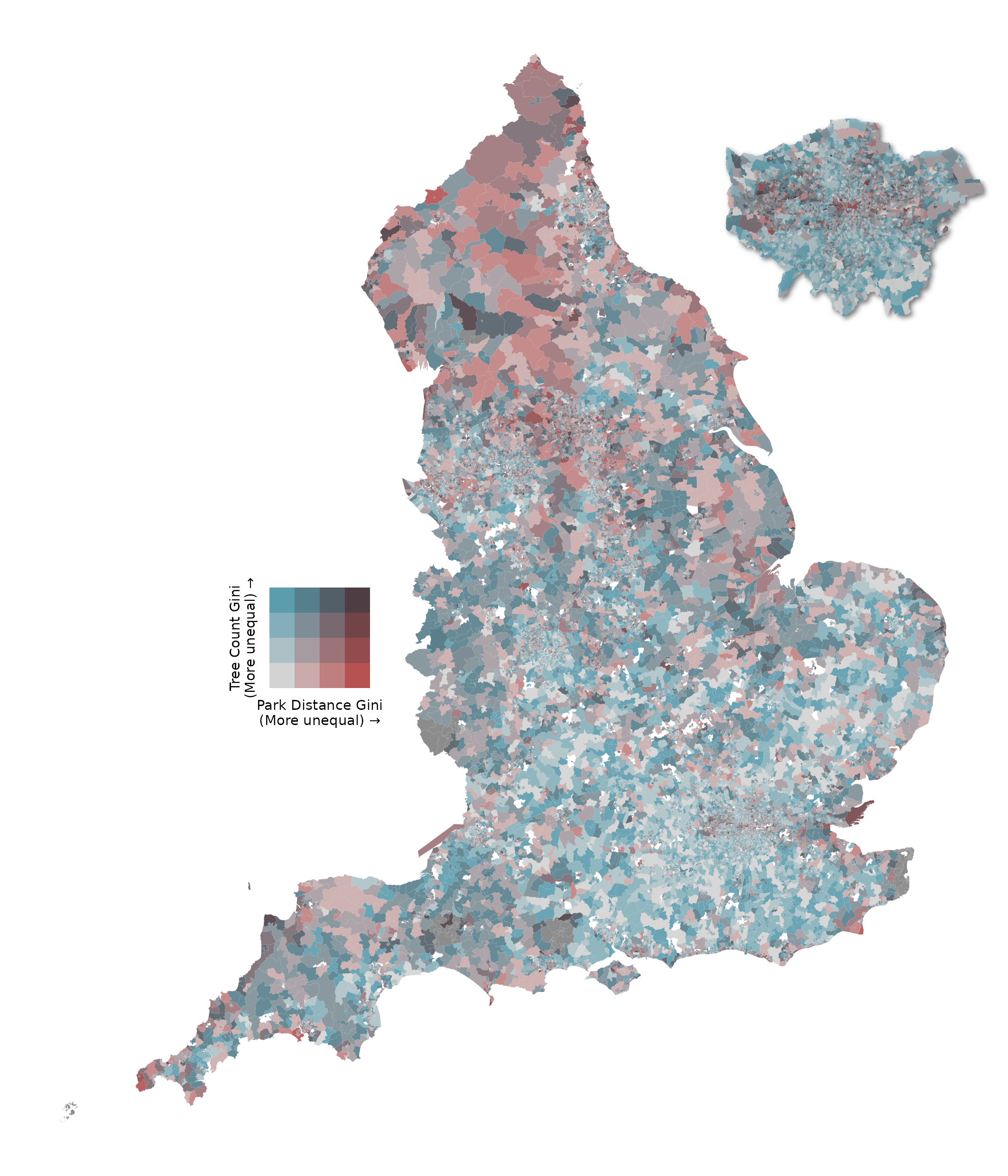
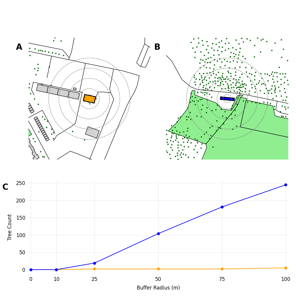
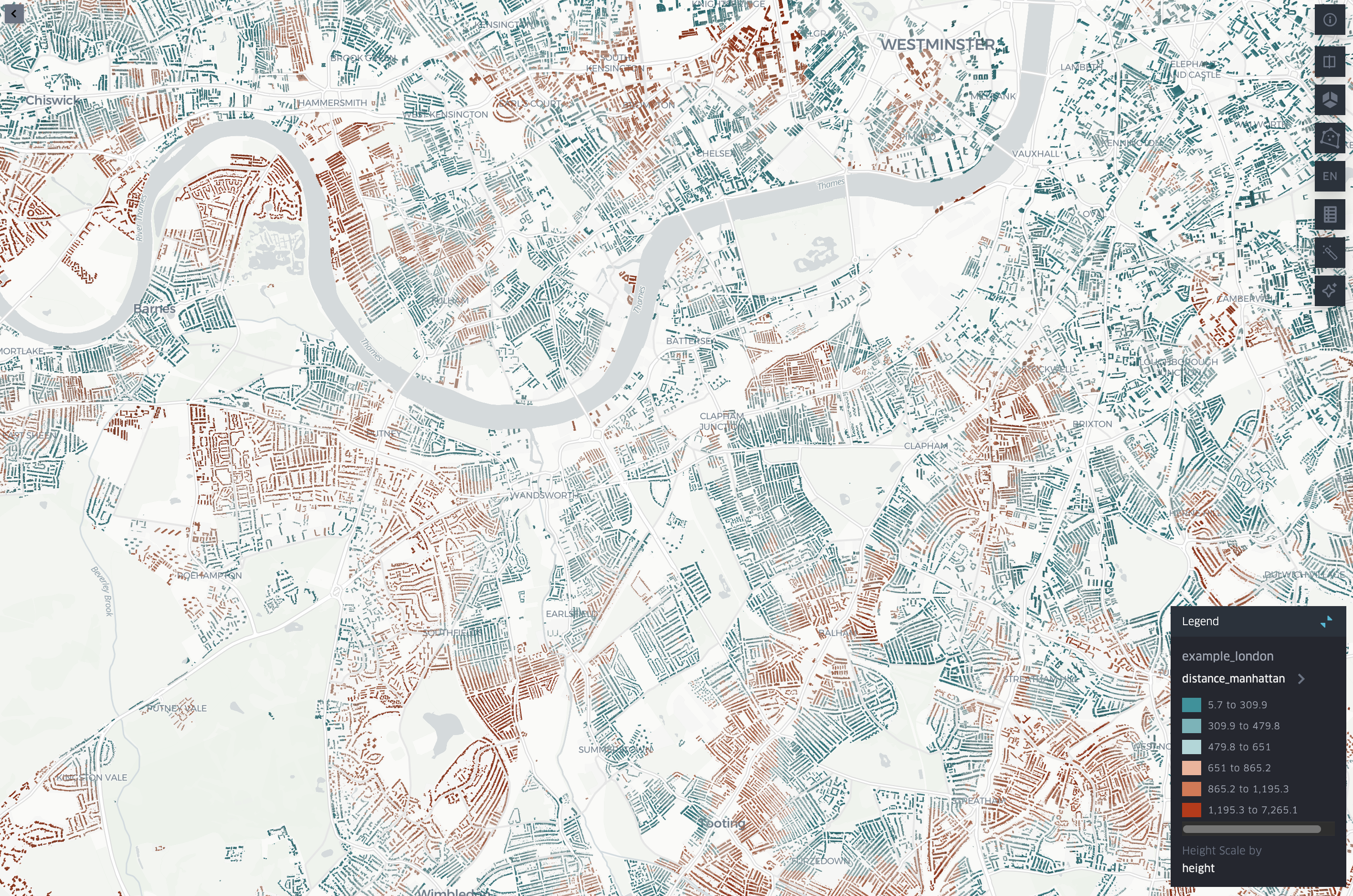
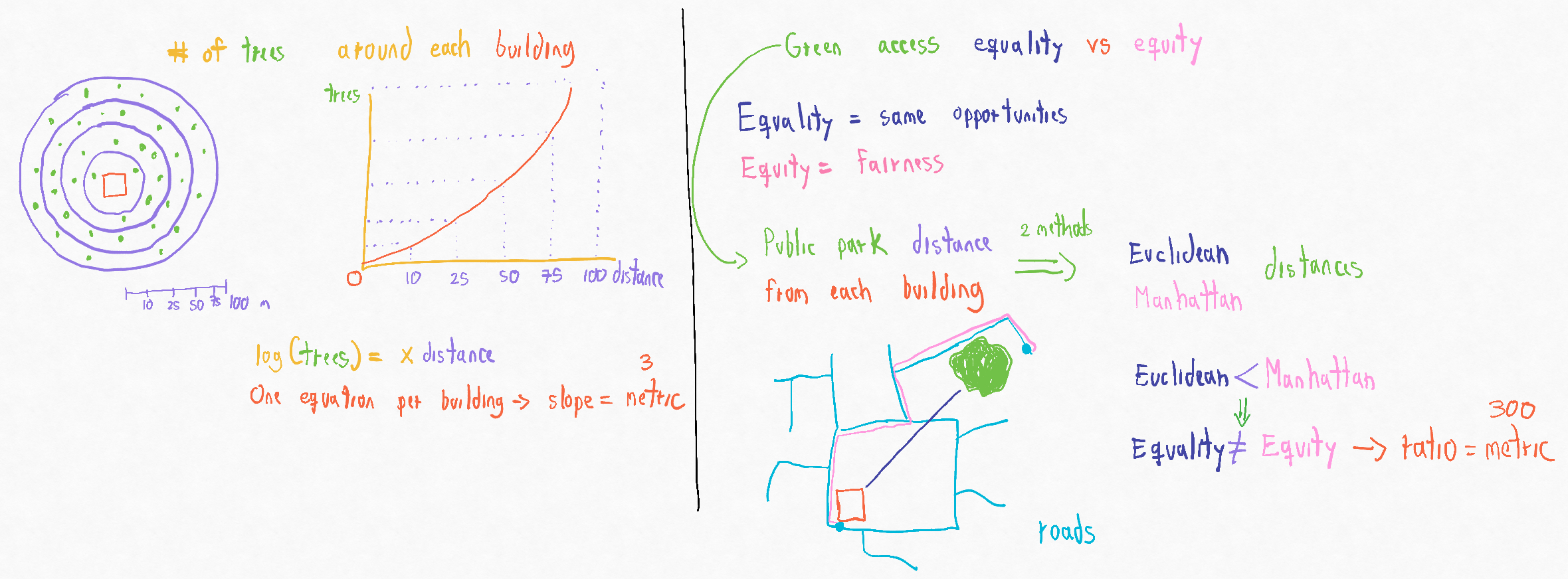
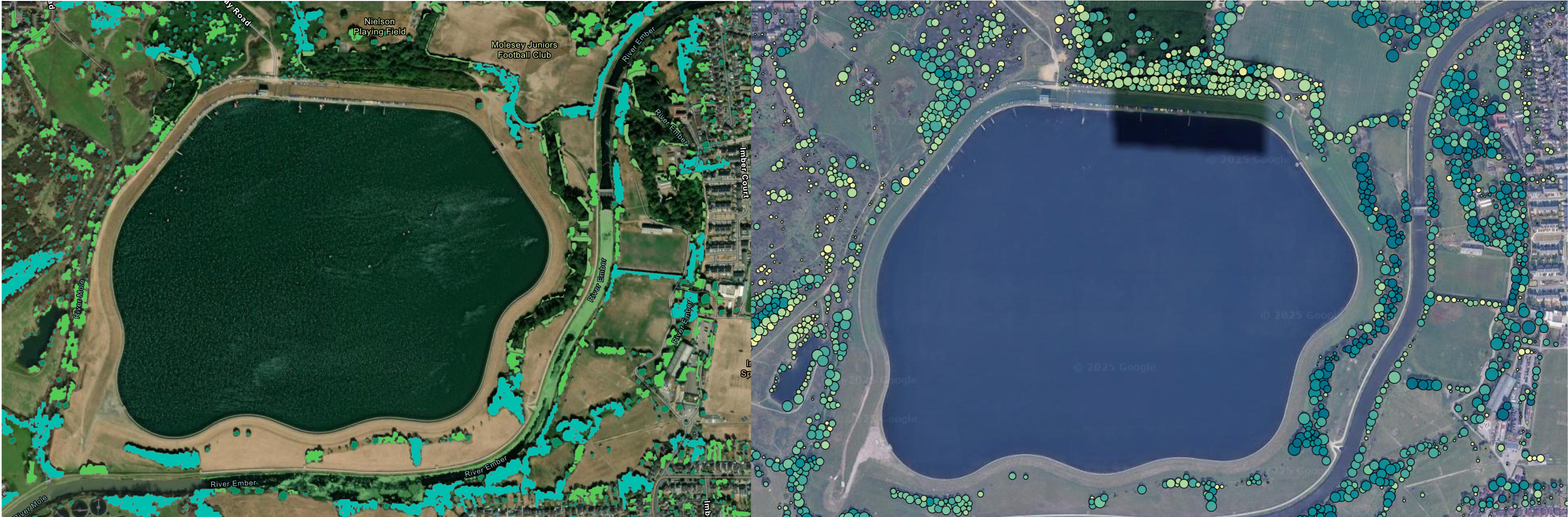
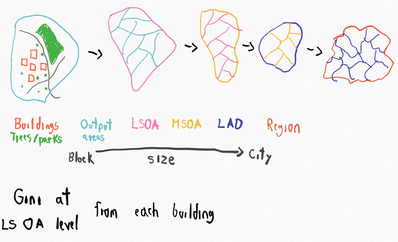
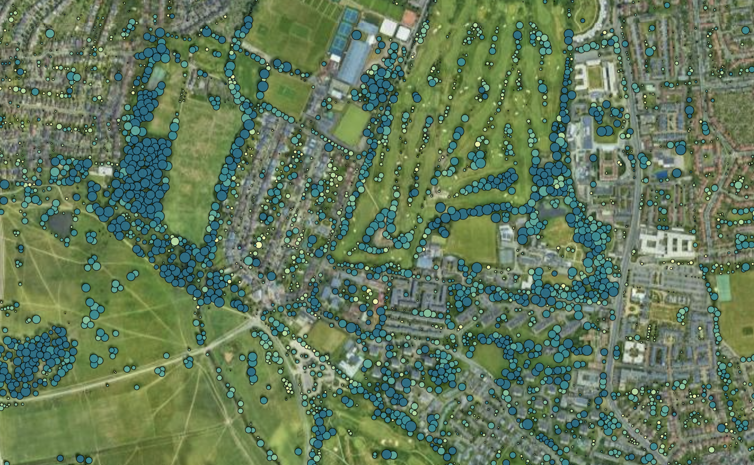
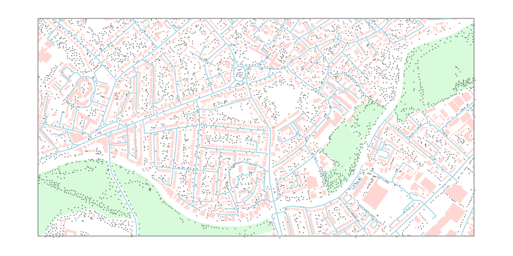
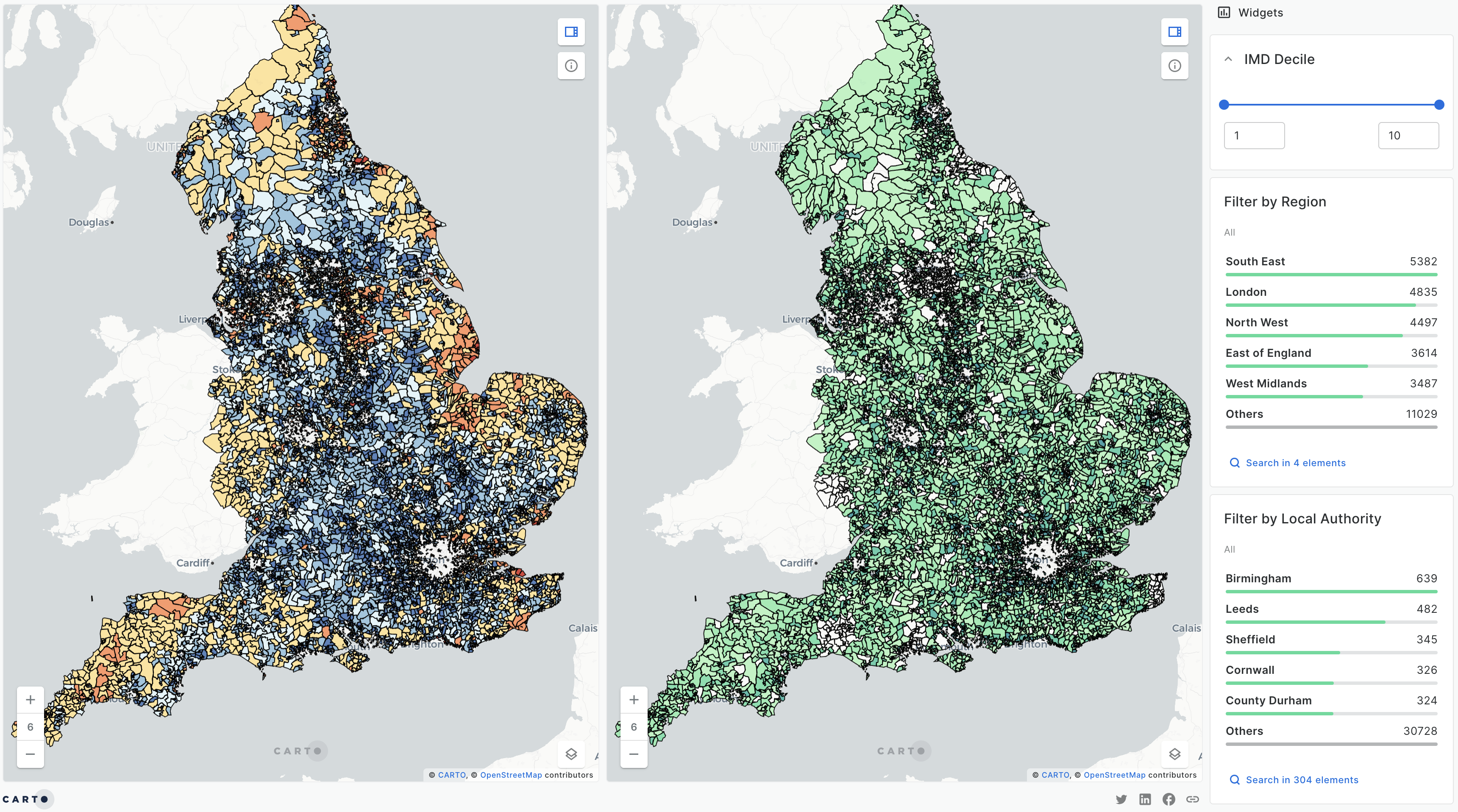
Visualization of the 3-30-300 rule in the UK
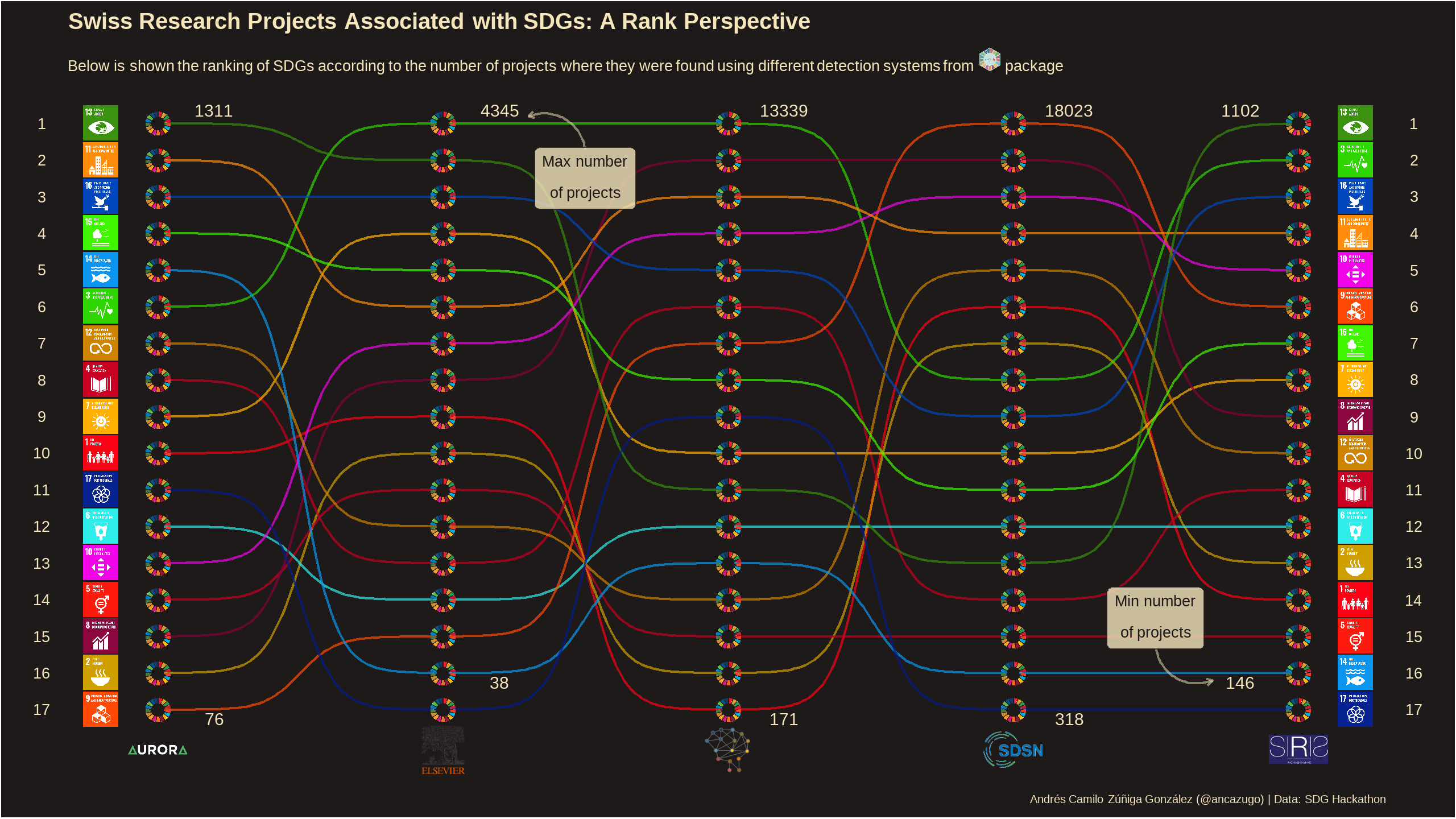
Analysing Swiss data on UN SDGs
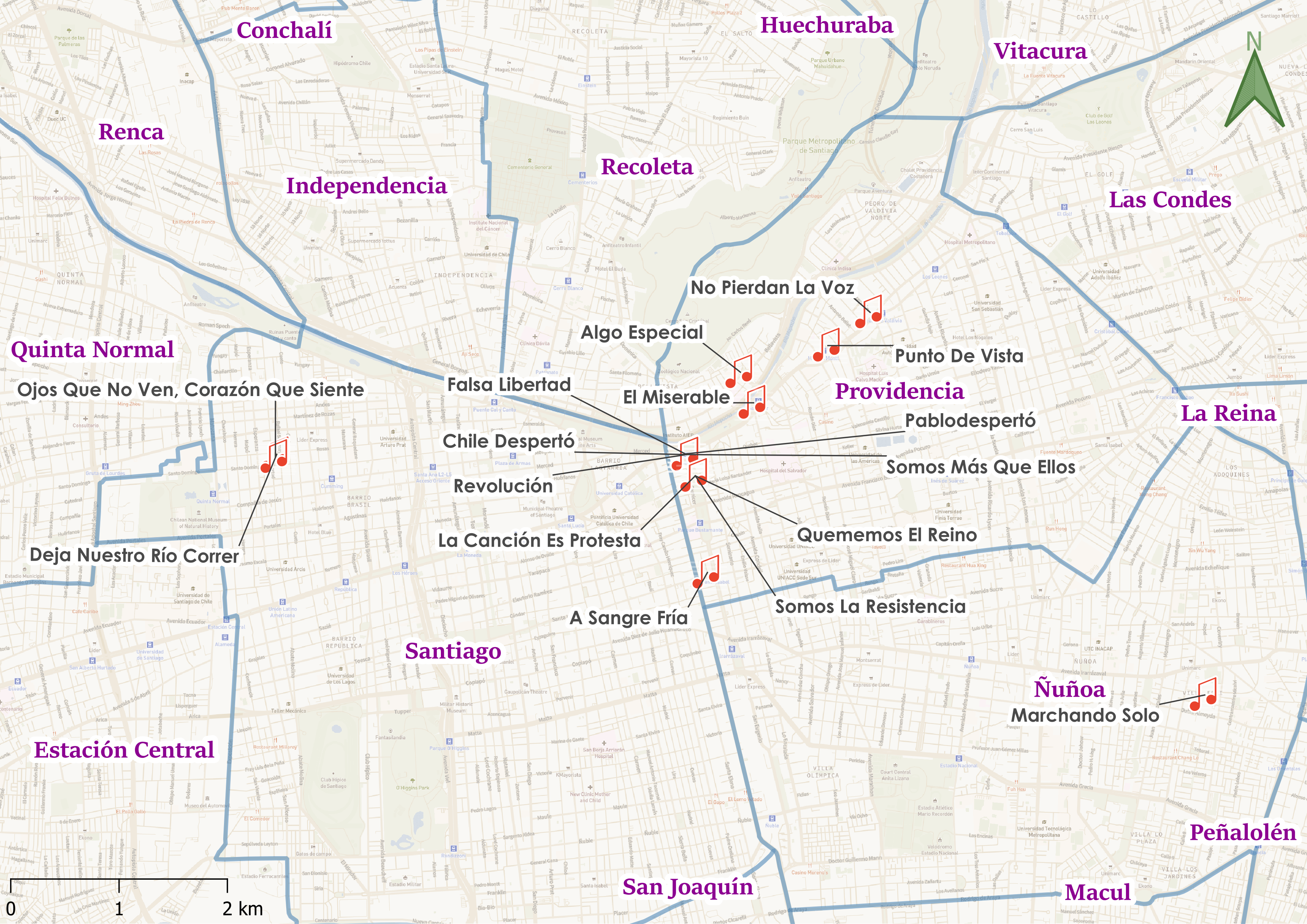
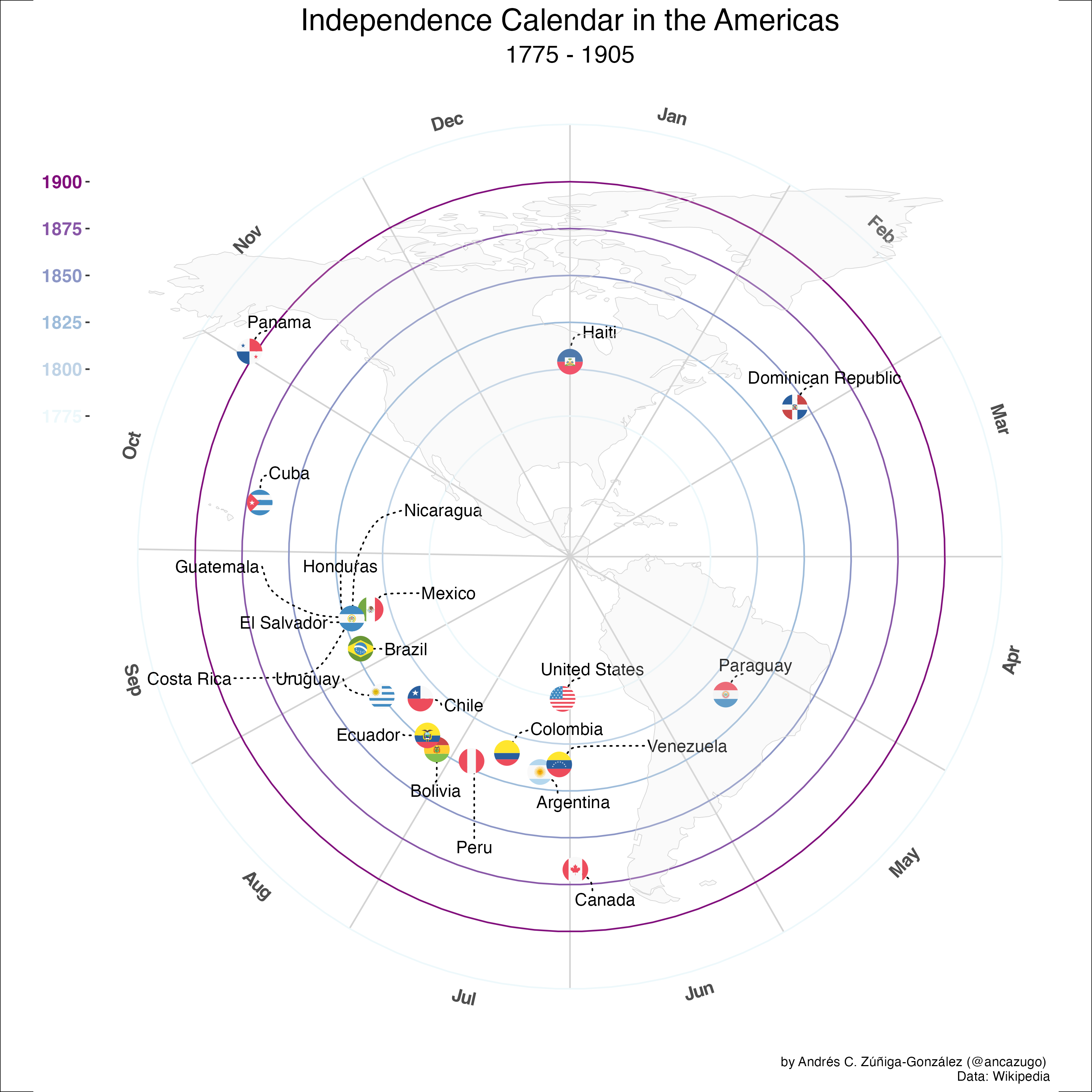
Visualizing a social movement through the eyes of music and maps
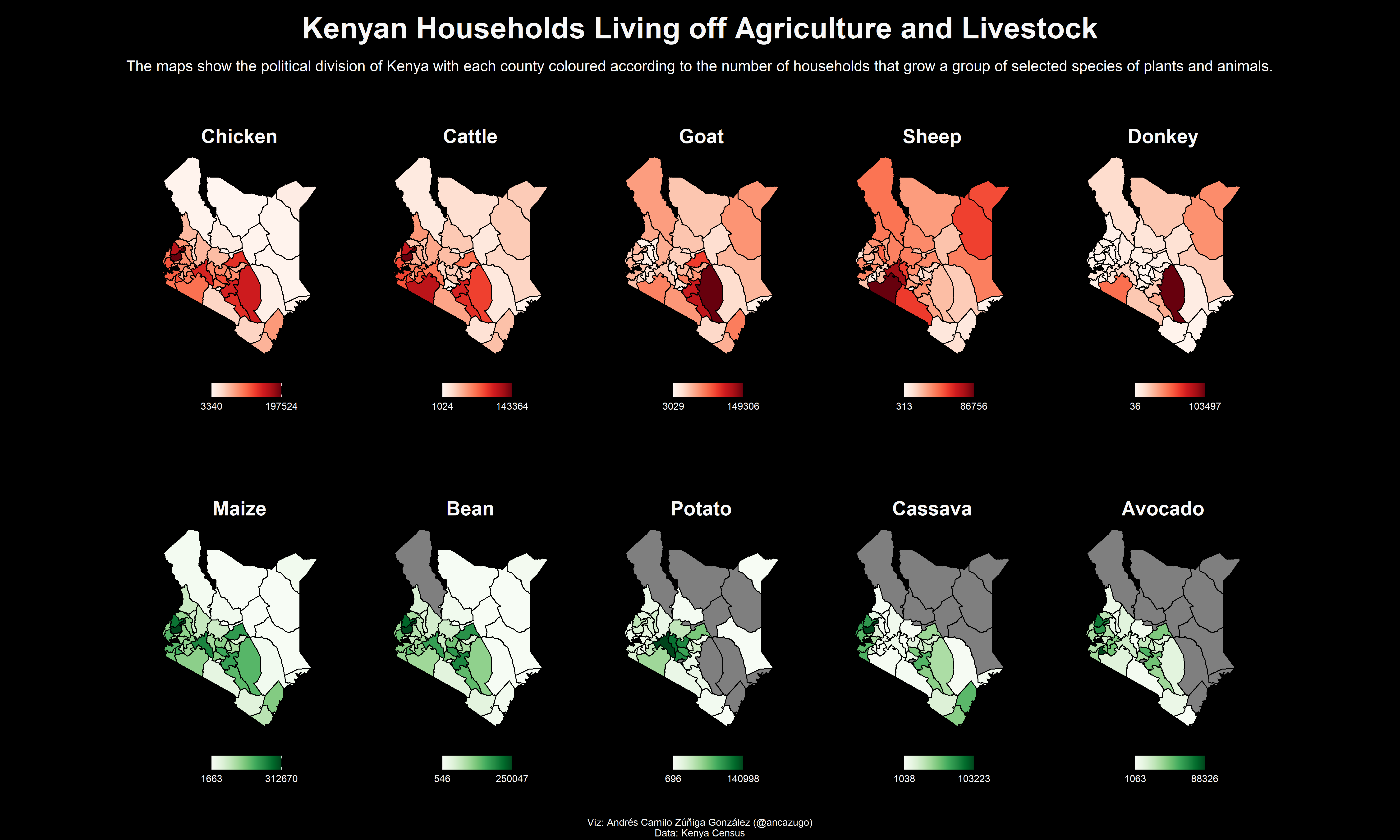
Using maps and small multiples for census analysis
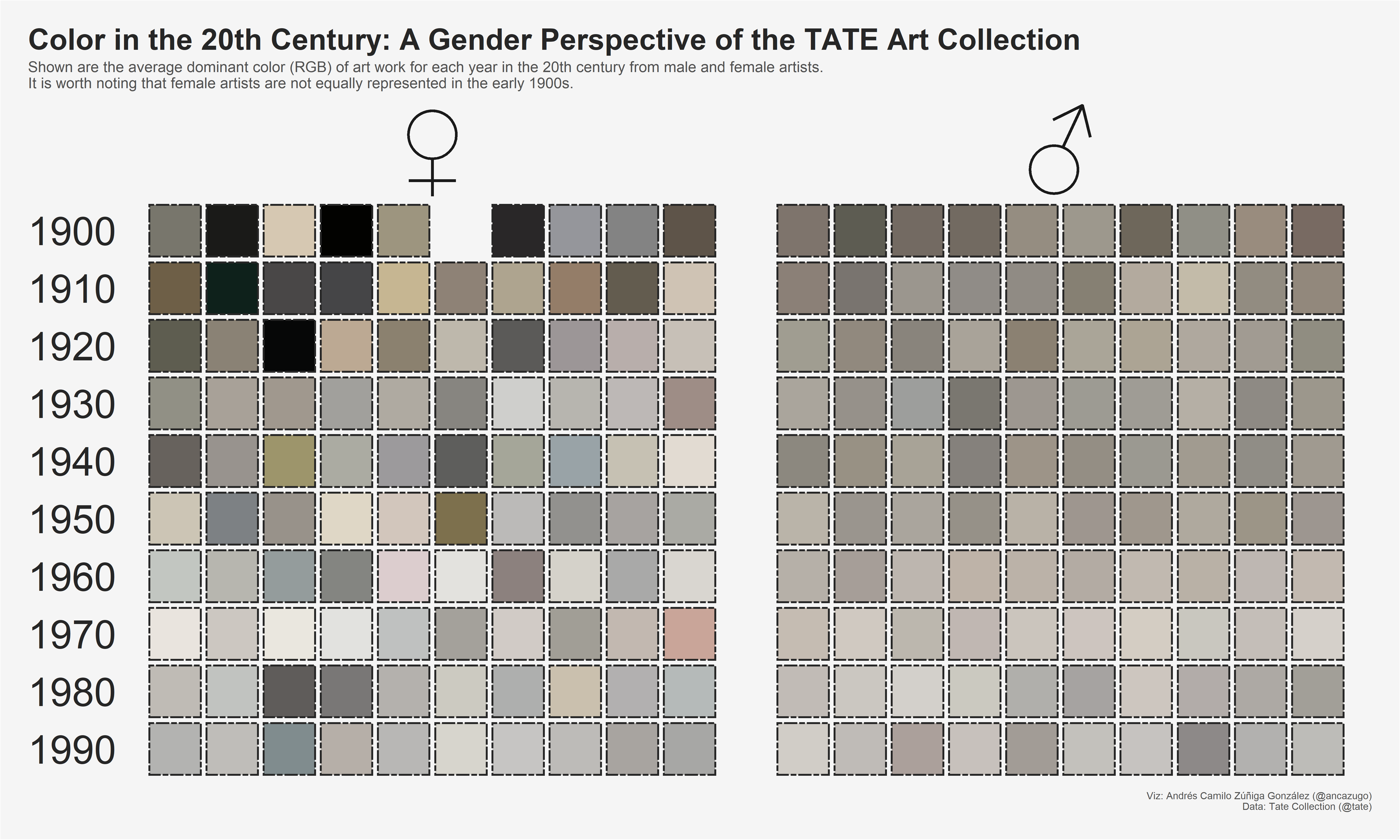
Color analysis of the TATE Art Collection
Using ggbump and ggflags for ranking analysis
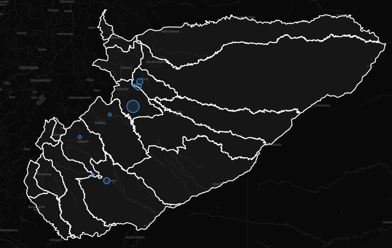
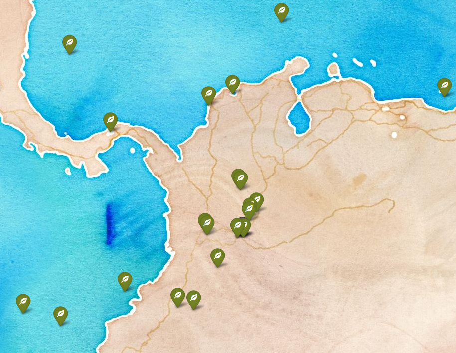
Distribution of Trypanosomatid-carrying bats in Casanare, Colombia
Visualization of every site where Paleolab members have worked
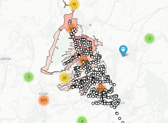
A Plotly app that facilitates the monitoring of COVID-19 and overcrowding in public transport in Bucaramanga

Text analysis of SwiftKey data for the Data Science Specialization in Coursera
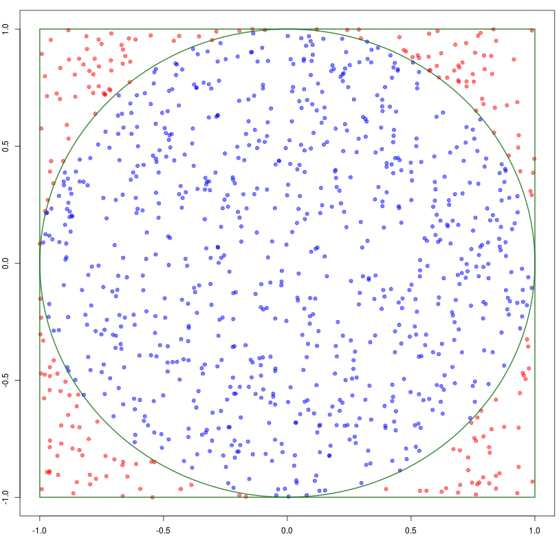
Using Shiny to build an app to estimate π
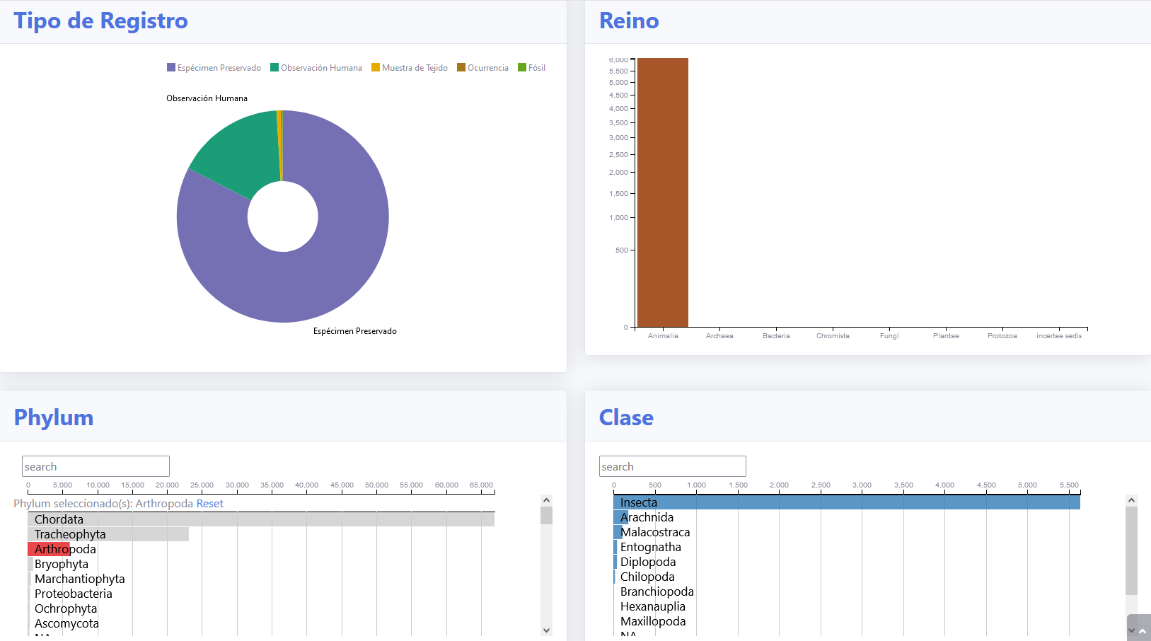
An interactive dashboard to measure Colombian biodiversity
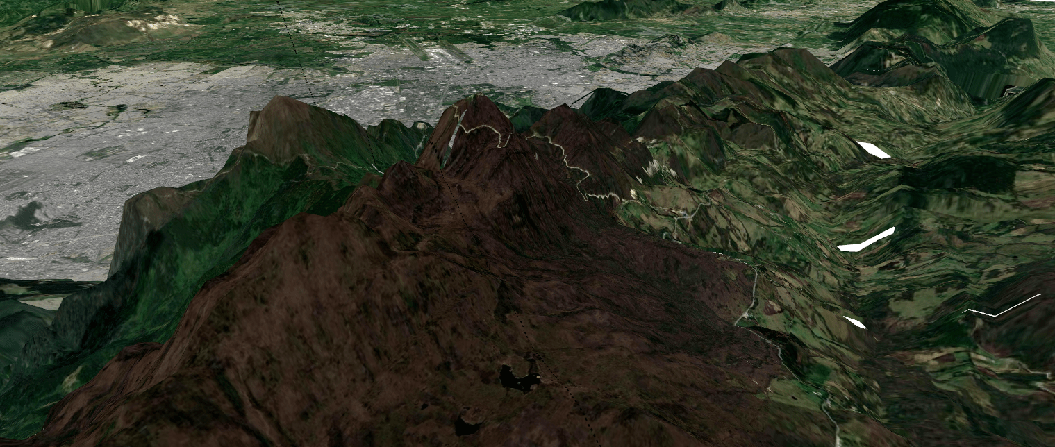
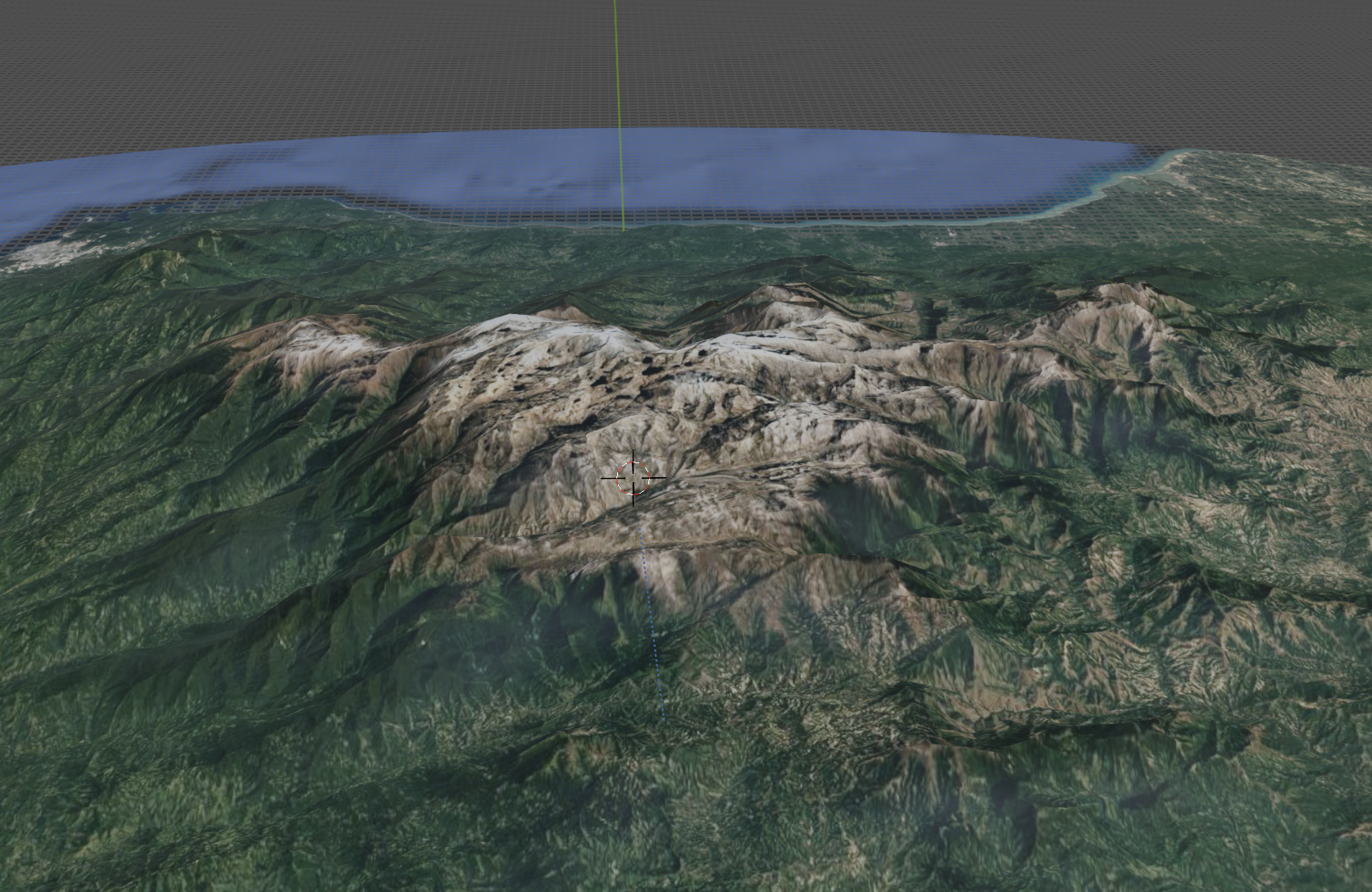
Visualization of the Cordillera viewed from the East near Bogotá
Using D3 to view connections among Transmilenio stations
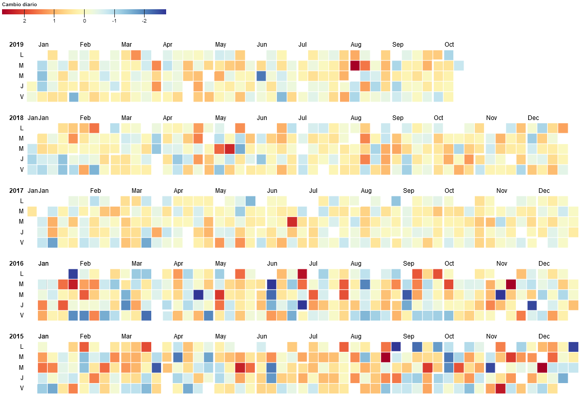
Calendar daaily view of the eschange rate between US Dollar and Colombian Peso
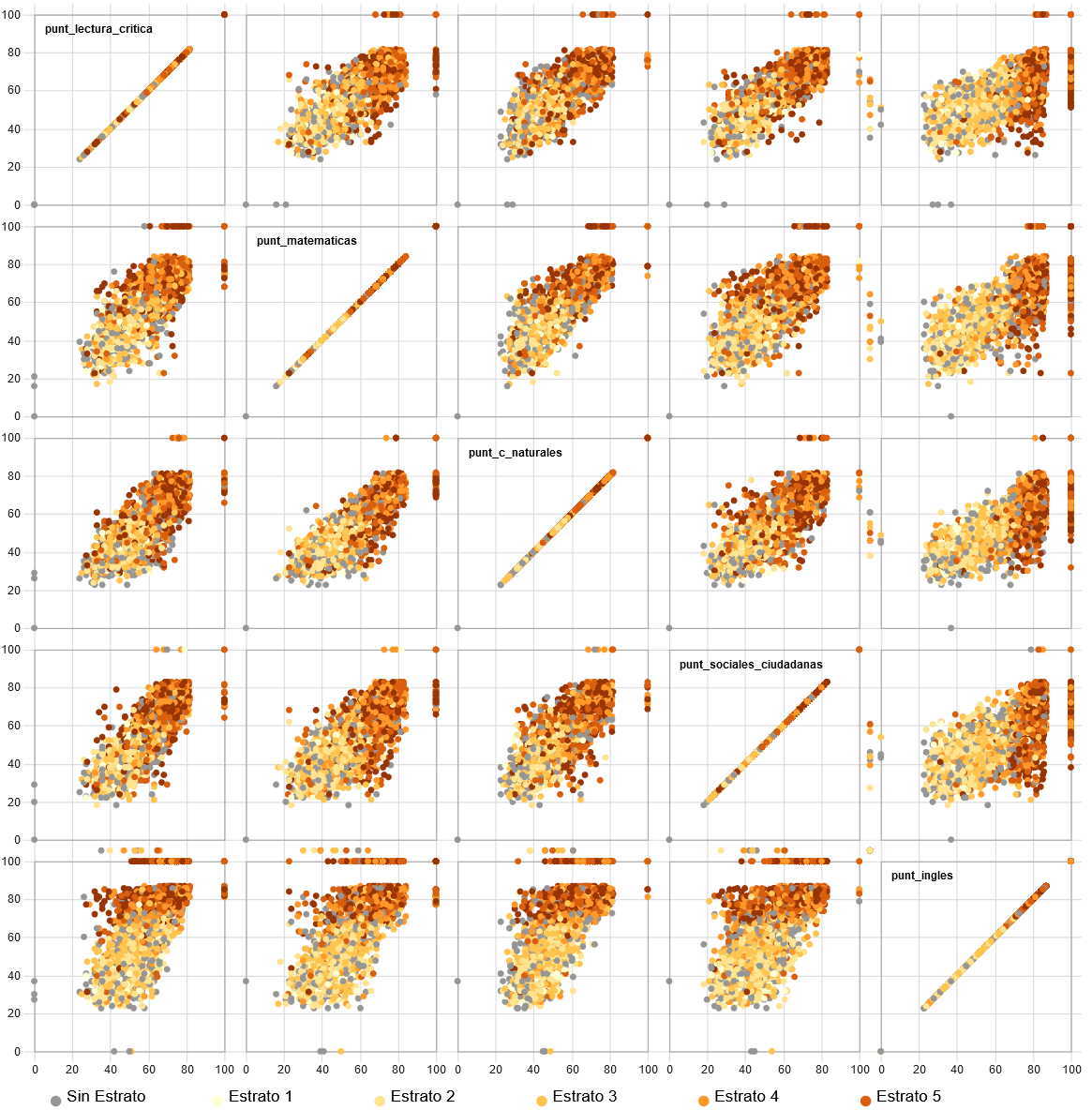
Visualization of the results of the nationwide exam for teenagers in Colombia